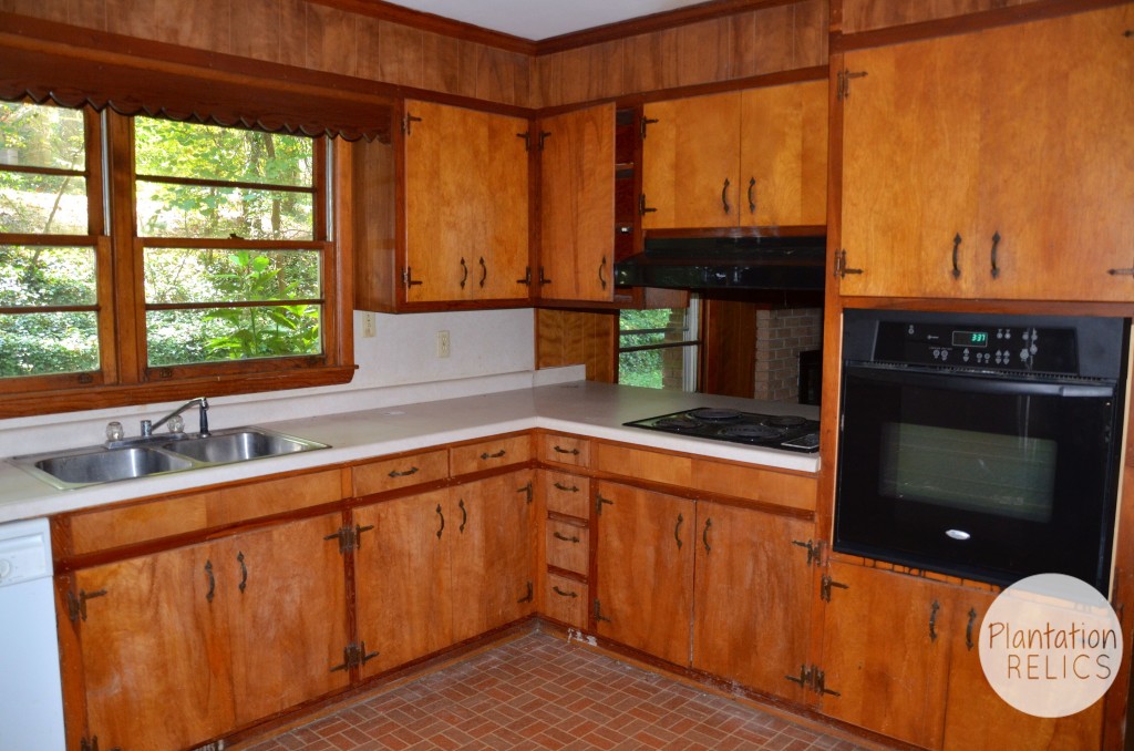
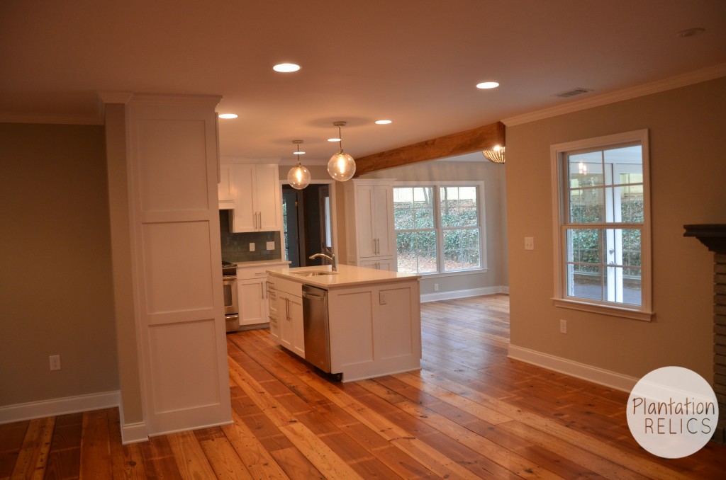
The Flip House is done and I couldn’t be more thrilled about how the kitchen turned out. It looks fabulous! As you can see the before of the kitchen above, it was dark and dated and needed a fresh look. You won’t believe your eyes when you see the after and how it looks now after adding the breakfast/keeping room. White and bright and just plain awesome.
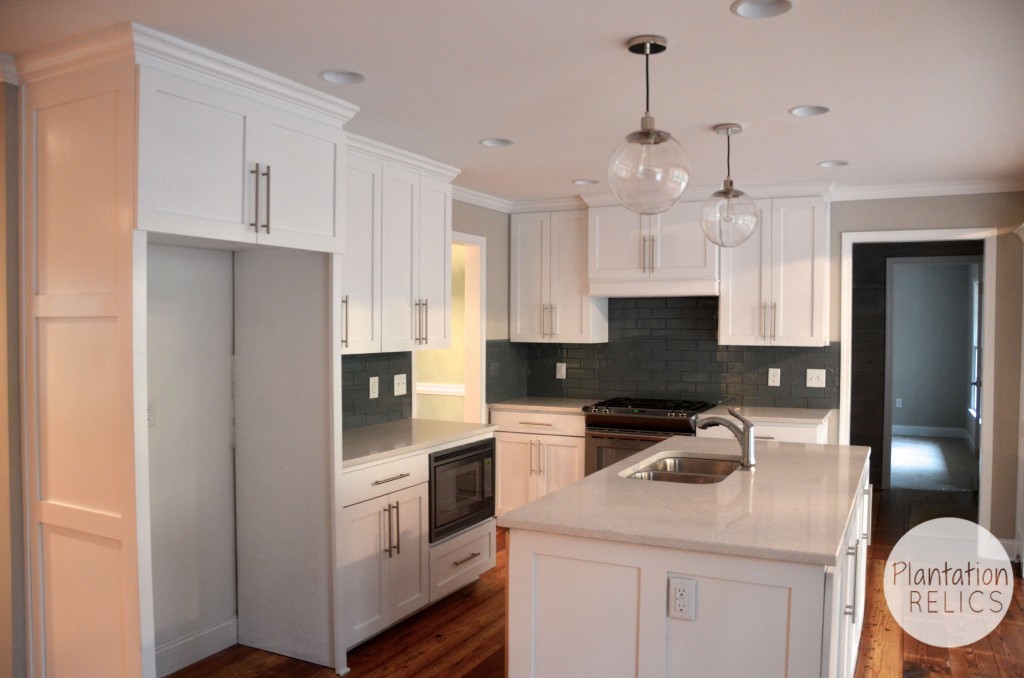
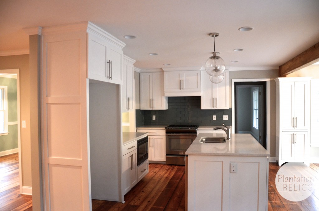
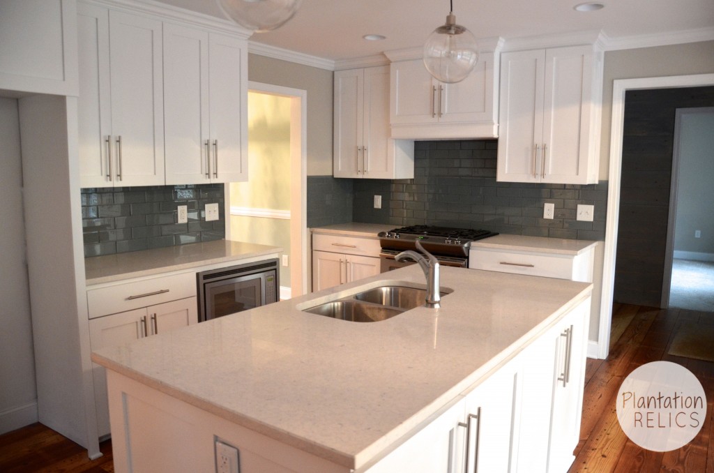
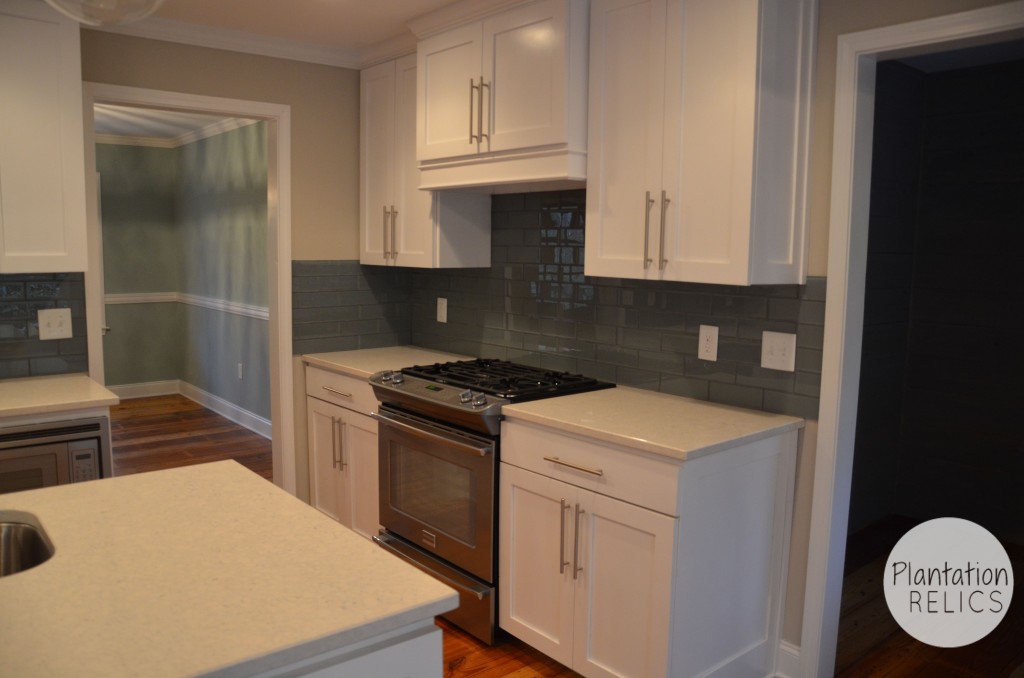
Here she is in all her glory! I mean who wouldn’t want to make dinner in this kitchen? It turned out so incredible. The white cabinets make the kitchen pop. I am so happy with the natural light and the open floor plan of the kitchen/breakfast area! The house really flows and allows the kitchen area to be a gathering place.
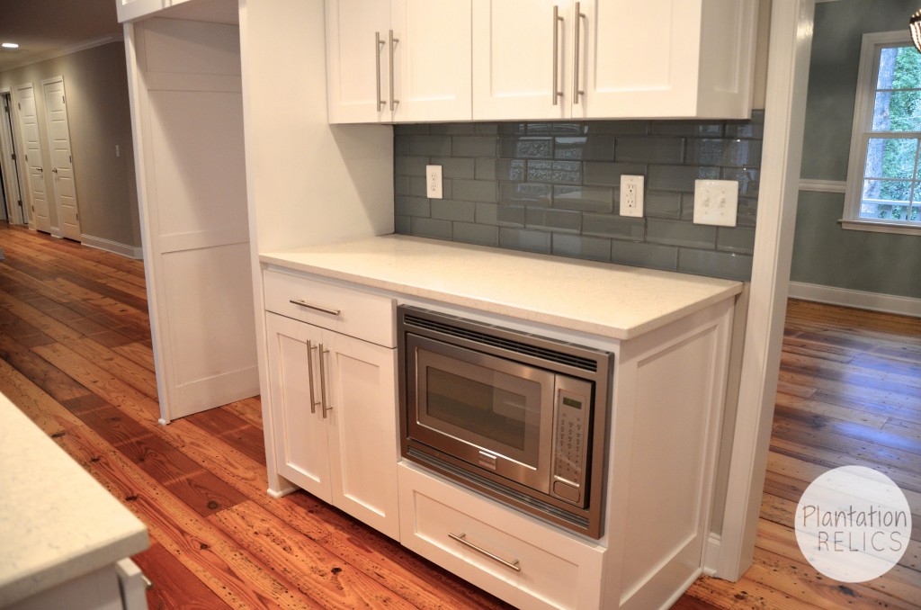
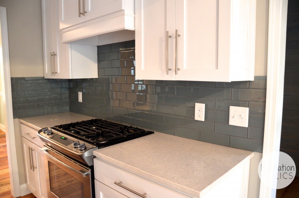
I had the microwave built in to the custom cabinetry to free up counter space. The backsplash is a gray glass tile with a gray grout. I choose sleek bar hardware to complete the cabinetry.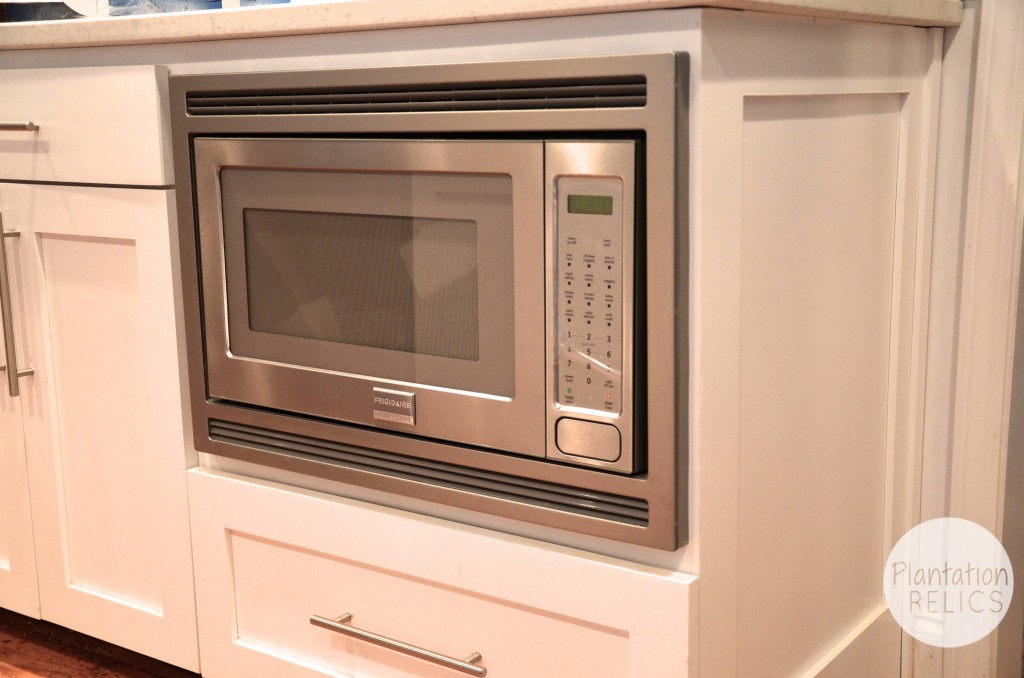
We added a professional gas stainless steel range and plenty of cabinets around it.
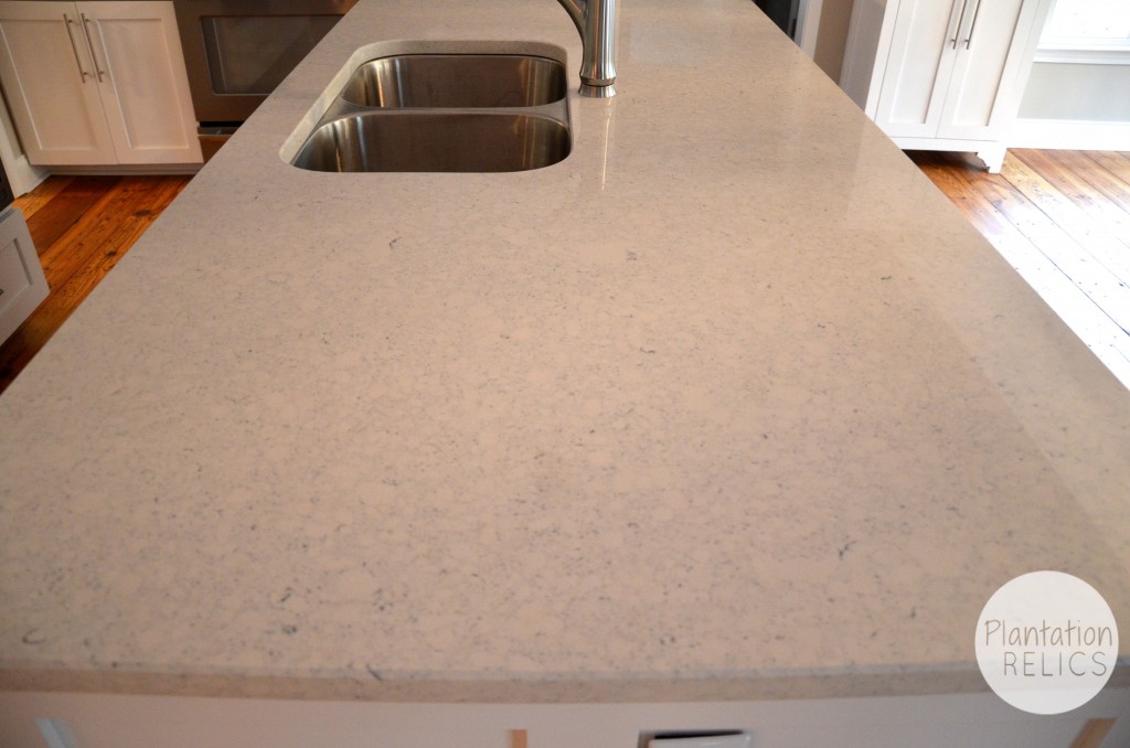
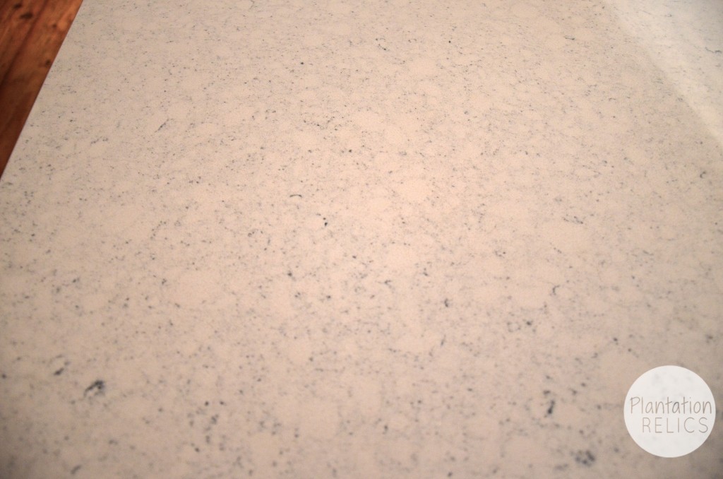
The countertops are Carrara quartz. This has been the most talked about thing in the kitchen. These countertops are incredible and extremely durable but give you the look of marble without the upkeep.
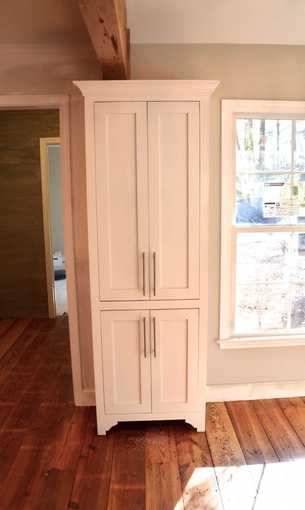
The pantry has an inset cabinet design and will function great in the kitchen with plenty of space for all the essentials.
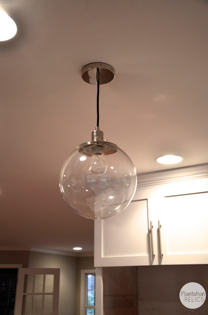
The pendant lights over the island are glass globes from West Elm that don’t block your view but still give the kitchen a needed accent. I actually put in Edison bulbs and they look outstanding inside the globe.
So what do you think about the final kitchen design and look?
As always, I appreciate your likes, shares and pins on my posts. Thank you so much!

Great Job Sabrina!!
Thanks so much Curt! I really had fun with it!
Sabrina, this is just absolutely stunning! Two thumbs up. I assume you’re trying to sell this place? I’m sure it won’t be on the market long. 🙂
Thanks girl! Yes we are selling it! Woohoo!
OMG It is beautiful!!
Thank you so much. It was a lot of work to get it to this point but well worth it!! The new owners can’t wait to move in.
Thîs is stunning!!
You are so sweet. Thank you so much. I absolutely love the way it has turned out.
Just stunning! So many wonderful pieces of eye candy, love it! 🙂
Thank you so much. It really brightened everything up.
Not my taste at all., just an inorganic, sterile hodgepodge. Those hanging class light balls are soulless dust collectors.
Wow thanks for the bash!
It says “speak you mind” so I did.
WEll you achieved that!
Unfortunately, there’s one in every crowd, Sabrina. I’d love to have this “inorganic, sterile hodgepodge” any day (or night) of the week! I think the molding and cabinet insets give this kitchen interest and beauty. I’ve wanted to put a glass block backsplash in my kitchen for years and seeing it in this kitchen reinforces that desire. As for the “soulless dust collectors,” I think they are beautiful and full of life. Practically speaking, they also illuminate the work area very well. I also think your neutral choices are perfect for a house that’s being sold.
When I was growing up, we were taught that if you didn’t have something good to say then don’t say anything at all. I think the world would be a better place if more people brought this practice back to life.
Yes and yes. There is always one that sits behind a computer and criticizes others. We achieved our goal so that is all I really care about it. Thank you for your comment. It turned out great and the new owners love it!
Lovely! This is exactly what I would love to have in my kitchen. Like the colors, placement, etc. Great job!
Thank you so much.
FAB. U. LOUS! I can’t imagine one thing that would make this kitchen better. Oh, wait, I do know one thing. It would be absolutely perfect if it were in my house. Great job!
After living the last 15 years with a white kitchen that the cats totally trashed, I’m now getting it painted a different color. The company that did the remodel used particle board for the doors that the cats have ruined on the lower doors so I’m getting them replaced with solid wood that will be stained then polyed to protect them. A former roommate demanded tile counter tops. I have just replaced them with quartz because they don’t need the upkeep like marble or granite.
So, I have to say that there are a number of things I like about your remodel and some I hate. I wondered what happened to that window over the sink in the before shot. I’m hoping you replaced the old window with a new one, maybe even larger, but I can never figure out exactly where the old carport/outside window were in the new kitchen.
Check on the last post Elic. We did an addition of a breakfast area off the back where that window was located. Much better with tons of natural light. The carport was closed in for 2 bedrooms and a shared bath. It’s all on the blog under Flip 1. Yay for solid wood cabinets. Make sure you use a varnish blend coating to reduce upkeep and durability. We did use quartz! It looks awesome.
At 1st I thought what a shame covering up such nice wood but on closer inspection I realized it was not nice wood but was stained to look like it was. I really don’t like a white kitchen. I really don’t like having the microwave in the island either. I would think that maybe this kitchen needs some color. In my kitchen I had white cupboards. But I when we walpapered it was white with antique cook stoves with red lines & small flowers. So when it came time to paint I did the front of the cupboards white but I painted the doors & drawer fronts red. We have a black formica counter that is about 50 years old but it was built for this kitchen & still looks good. The cupboards were built for this kitchen also. We needed to cover the walls that we didn’t wallpaper so we put up brick paneling. We had a brick pattern in the floor covering too so everything matched. We have since gotten new appliances which are beige & have a new floor covering that looks like a hardwood floor & the cupboards are painted beige because my pushy daughter convinced my husband it would be easier to keep clean. ….I have gotten used to the colors but I am not really happy with the way it looks. It’s a big kitchen compared to what we had in the old cape cod house we used to own. I guess to each their own when it comes to houses.
That’s right to each his own. What some people seem to be missing is that this is a flip and white kitchens sell and sell fast. The design works and turned out great. BTW the microwave isn’t in the island.
Beautiful job, well thought out design , and I love white cabinets, this kitchen has a nice clean and modern look. I score it at the top!
I love the new kitchen! Some things I wouldn’t do in mine, but overall, it looks great! I have one question…what did you use on the floors? Is that real hardwood? Or laminate? They’re gorgeous!!
The floors are definitely the real deal! They are reclaimed heart pine. Find the post here for the details. http://www.plantationrelics.com/?p=787
So lovely! I especially love those floors!
The floors are to die for aren’t they?
Do you mind if I ask you how much this all cost (minus cost of appliances)? The before pictures looks like the kitchen in the home I about to buy.
Sorry I missed this comment Michelle. Send me an email at sabrina@plantationrelics.com and I can get the info over to you. Thanks!
You did a fine job on this kitchen, but I wonder how it’s working out to have so little countertop? Any reports from the buyer? I’d would need a place to roll out pastry and don’t see likely place except by the sink, which doesn’t work for me.
I guess I’m too old fashioned, as I’d like a place on the ceiling to hang a pot rack and with all the light fixtures it wouldn’t work. I did have 2 sets of ceiling spots installed in my kitchen, one for the pastry area and another over sink and the other counter, so I really do appreciate your good lighting.
This one is quite stark and way too much white to have to keep clean for me, but white is in and you are marketing well…&…..maybe younger people don’t cook much????
PS. My current kitchen is smaller, but looks a lot like this one was. I hate it, but am not a flipper, so will sell the house as is and move to an apartment, where i don’t plan to bake or cook anymore. Age makes a difference!!! Good luck on all your projects!
The only thing I have heard from the new owners is that they love the house. The island is 6 feet long so I would think there would be plenty of counter space. There is also lots of space beside the refrigerator above the microwave. As far as a pot rack, these are 8 foot ceilings and a pot rack would hang down too low over the sink. Also, this is not something buyers are looking for when looking at houses. Lights are what people want over an island. White is definitely in and when you are flipping houses, you go for a VERY neutral house so anyone that is looking can visualize themselves there. Most people CAN’T look past really personalized houses (ie colors, wallpaper, clutter, etc.). Thank you for your comment.
Thanks for your reply. The ceilings look higher in the photos.
I guess I’d never make it flipping houses!!! Good thing I’m too old to consider doing it…LOL
Keep on having successful projects…..!!!
Hey, love the whole shebang! I had a question about the floor…what are those white breaks in the flooring…is that from the stain?
Sorry CB just saw this comment. The floors are faced nailed down meaning they are nailed right into the subfloor. There are gaps in between the floors (not big). I guess in the pictures it looks like white but there is no white on the floors. Thanks for looking.
I’d like to say my opinions but from some of the comments I read when someone says anything negative I will keep them to myself. Says Speak your mind but they obviously don’t really mean it.
Go right ahead. Most people say comments without reading the posts about the project. Please keep in mind this is a FLIP house and sold immediately after being put on the market.
Love this house! Do you have a rough outline of the floor plan after you made the changes? I’m having a hard time picturing where all of the rooms are, but it looks like a great layout!